Mar 25, 2014 | Posted by Ben Thompson
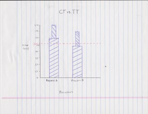
With data collected and in hand it is time to put it to good use to get one step closer to a kaizen victory. But raw data can be pages and pages of mind numbing numbers in rows and columns. So how do we present it in a neat, tidy and easy to read manner. We process the raw data into an easy to interpret graph that compares our current cycle times with our desired Takt time, a cycle time vs. Takt time graph.

A cycle time vs. Takt time graph, or CT vs. TT graph, depicts the Takt time as a broken line across the entire graph, in the case of our displayed graph from our Takt time posts imaginary company we see the broken red line is 126 seconds per piece. Now we see process A is well over the Takt time as the fat bar is past our broken red line. This fat bar is the lowest repeatable time, showing us that Takt time was never even met in our observations. This likely mean the work content was far too high for the number of workers in that work area. Process B on the other hand show a very different story.
The fat bar of process B is below our Takt time line, though a skinnier bar on top of it still breaks by our Takt time line. This skinny bar on process B is representative of process B‘s fluctuation being higher then our Takt time but that the lowest repeatable time is below it. This is why Process B’s story is very different then process A’s, there is most likely enough workers working in process B to meet Takt time but other problems must be solved through kaizen to stabilize process B for it to be a smooth running process on our shop floor. We are well on our way to a kaizen victory, but what if change hits a speed bump? Next week we will talk about why and how change can be resisted and how we can try to over come that with the power of TPS by,
Keeping
Calm,
and
Kaizening
On!